

EN The development of the Bárbara Milan Dermatologist brand aimed to reflect the client's personality as well as her profession, adopting a delicate, simple, and clean identity while incorporating her initials. During the briefing, Dr. Bárbara shared her vision of dermatology, saying: “Dermatology is a specialty that has the ability to change the way we interact with the world.”. From this perspective, the hair follicle was chosen as the central element of the brand, symbolizing the skin as a protective barrier between the internal and external. The hair strand, much like a personal or professional brand, acts as an interface, representing a way of presenting ourselves to the world.
PT O desenvolvimento da marca Bárbara Milan Dermatologista teve como propósito refletir a personalidade da cliente assim como sua profissão, adotando uma identidade delicada, simples e clean, e incorporando as iniciais de seu nome. Durante o briefing, a Dra. Bárbara compartilhou sua visão sobre dermatologia, dizendo: “A dermatologia é uma especialidade que tem a capacidade de mudar nossa forma de interação com o mundo.” . A partir dessa perspectiva, o bulbo capilar foi escolhido como elemento central da marca, simbolizando a pele como proteção entre o interno e o externo. O fio capilar, assim como a marca pessoal ou profissional, atua como uma interface, representando uma forma de nos apresentarmos ao mundo.

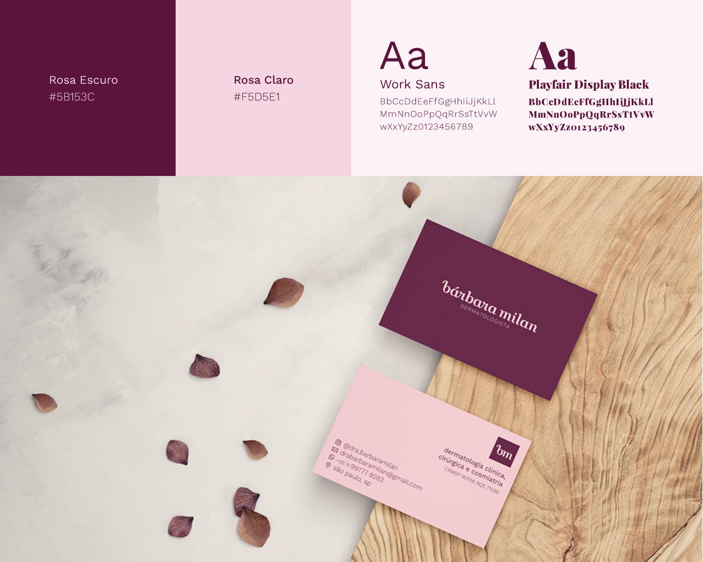
EN The logotype and emblem were designed to illustrate the concept of the hair follicle and strands, with the letter “b” representing the follicle and the letter “m” symbolizing the tips of the hair. Both versions use ligatures and curves, with lowercase letters to transmit youthfulness and modernity. The symbol and the name form the visual identity independently, yet complementarily.
PT O logotipo e o emblema foram desenhados para ilustrar o conceito do bulbo capilar e dos fios de cabelo, com a letra “b” representando o bulbo e a letra “m” as pontas dos fios. As duas versões utilizam ligaturas e curvas, com letras em caixa baixa para transmitir jovialidade e modernidade. O símbolo e o nome formam a identidade visual de forma independente, porém complementar.